
「Floromance」: The Journey to a Perfect Logo
After countless challenges and creative explorations, the logo for 「Floromance」 has finally been finalized. This milestone marks the culmination of a deeply personal and inspiring journey—one that began with a simple yet profound realization about the power of flowers and romance.
The Inspiration Behind 「Floromance」
Our founder was once someone who spent countless days and nights agonizing over the perfect gift. One Valentine’s Day, while observing happy couples carrying flowers, it became clear: flowers are the ultimate gift, suitable for any occasion. But there was a catch—they couldn’t be ordinary. To truly capture romance, the gift had to be unique.
This realization sparked an idea: what if there was a way to preserve the beauty of flowers and the romantic moments they symbolize? This vision led to the creation of 「Floromance」—a brand dedicated to not just delivering flowers, but immortalizing the emotions they evoke.
Discovering the Eternal Flower
In our quest to preserve romance, we explored countless flower varieties until we discovered preserved flowers. These timeless blooms capture the most beautiful moment of a flower’s life, embodying the essence of what we wanted to offer: a love that never fades.
But as we prepared to share this gift with the world, we faced a new challenge: how could we make 「Floromance」 stand out? The answer lay in creating a logo that was as unique and meaningful as our mission.
The Meaning Behind the Name
The name 「Floromance」 is a fusion of two words: “floral” and “romance”. While flowers are at the heart of what we do, it’s the romance they inspire that truly defines us. To reflect this, we combined the “R” from “romance” with the “R” from “floral”, creating a name that speaks to our core belief: romance is eternal.
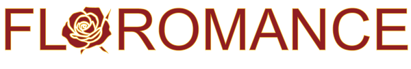
The Birth of the Logo
Our first logo design centered on the word “romance”, using elegant, flowing typography to convey a sense of artistry and emotion. The remaining letters, “flo”, were designed to resemble flowers and leaves, while the “O” was shaped like a heart—a subtle nod to the love we aim to celebrate.
However, we quickly encountered a problem: when placed in a page header, the logo stretched into a long, unappealing line. Attempts to isolate the “flo” element as a standalone logo also fell short, leaving us with a design that felt incomplete. After two months of trial and error, we were forced to delay our website launch, still searching for the perfect solution.
Seeking a Breakthrough
Frustrated but determined, we turned to external designers for fresh perspectives. The first designer made minor adjustments to our original concept, but it still didn’t resonate with our vision. The second designer took a completely different approach, but the result felt more suited to an environmental tech company than a brand centered on romance.


While these attempts didn’t yield the desired outcome, they provided valuable insights. We realized that the “F” in our design needed to be closer to the main body, and the “romance” typography required a more distinctive, handcrafted feel.
Returning to the Essence
Taking these lessons to heart, we revisited our original concept with a renewed focus. We refined the typography, adding subtle flourishes to the strokes and adjusting the angles for a more dynamic look. Inspired by other websites, we also experimented with using a smaller, more compact version of the logo for page headers—a solution that finally addressed our layout challenges.
The Final Design: A Symbol of Eternal Romance
The result is a logo that perfectly encapsulates the essence of 「Floromance」. The flowing, elegant typography of “romance” immediately conveys warmth and emotion, while the floral-inspired “flo” element adds a touch of natural beauty. The heart-shaped “O” ties it all together, creating a design that is both visually striking and deeply meaningful.
Our Promise to You
At 「Floromance」, we believe that every flower tells a story—a story of love, connection, and unforgettable moments. Our logo is more than just a symbol; it’s a promise to preserve the romance in your life, one bloom at a time.